Type & Image investigates the relationship between form and message, and aims to create an awareness of the conceptual nature of graphic design: that the designer is at the same time both form-builder and message-maker.
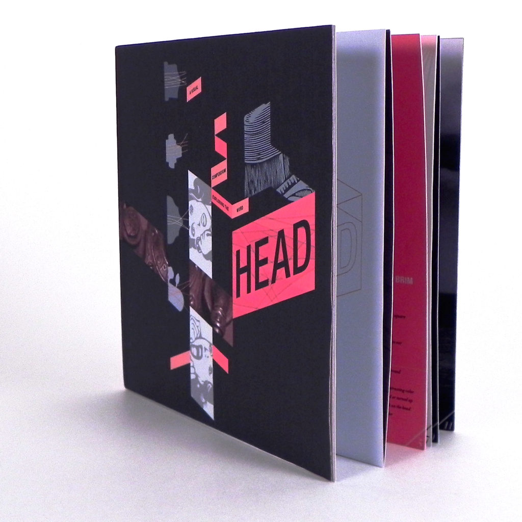
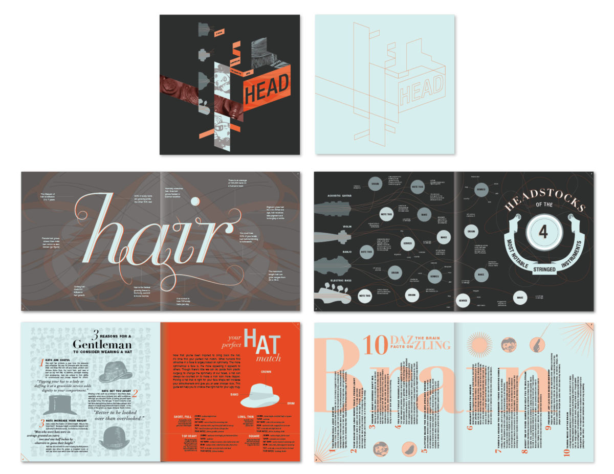
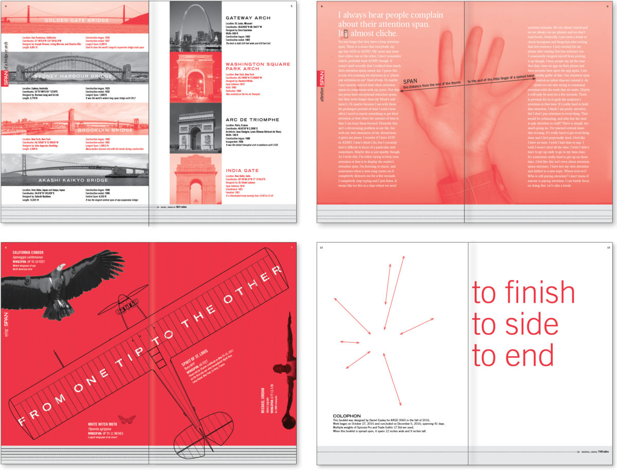
Words/Meanings Publications
Students investigate the various denotative and connotative meanings of a given word the compile their visual and textual content in a multi-page publication.The content and design explores and comments on the various and layered meanings, and social/cultural context of the word.
Three Expressive Modes of Visual Language
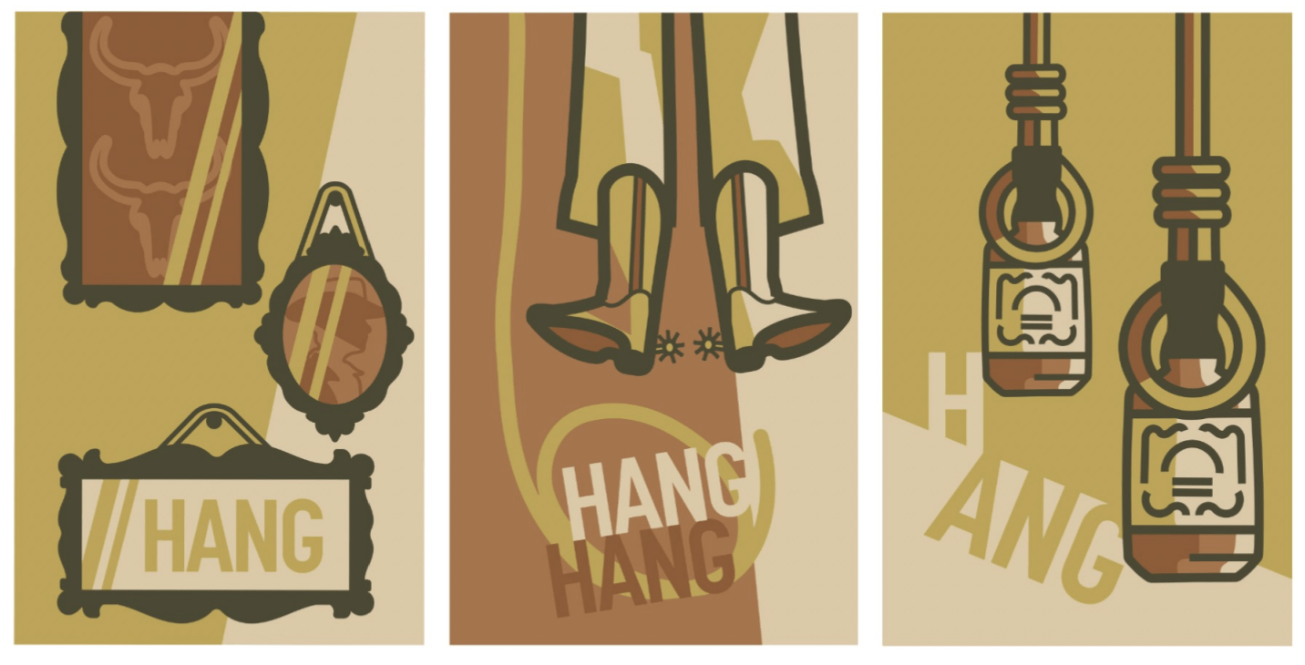
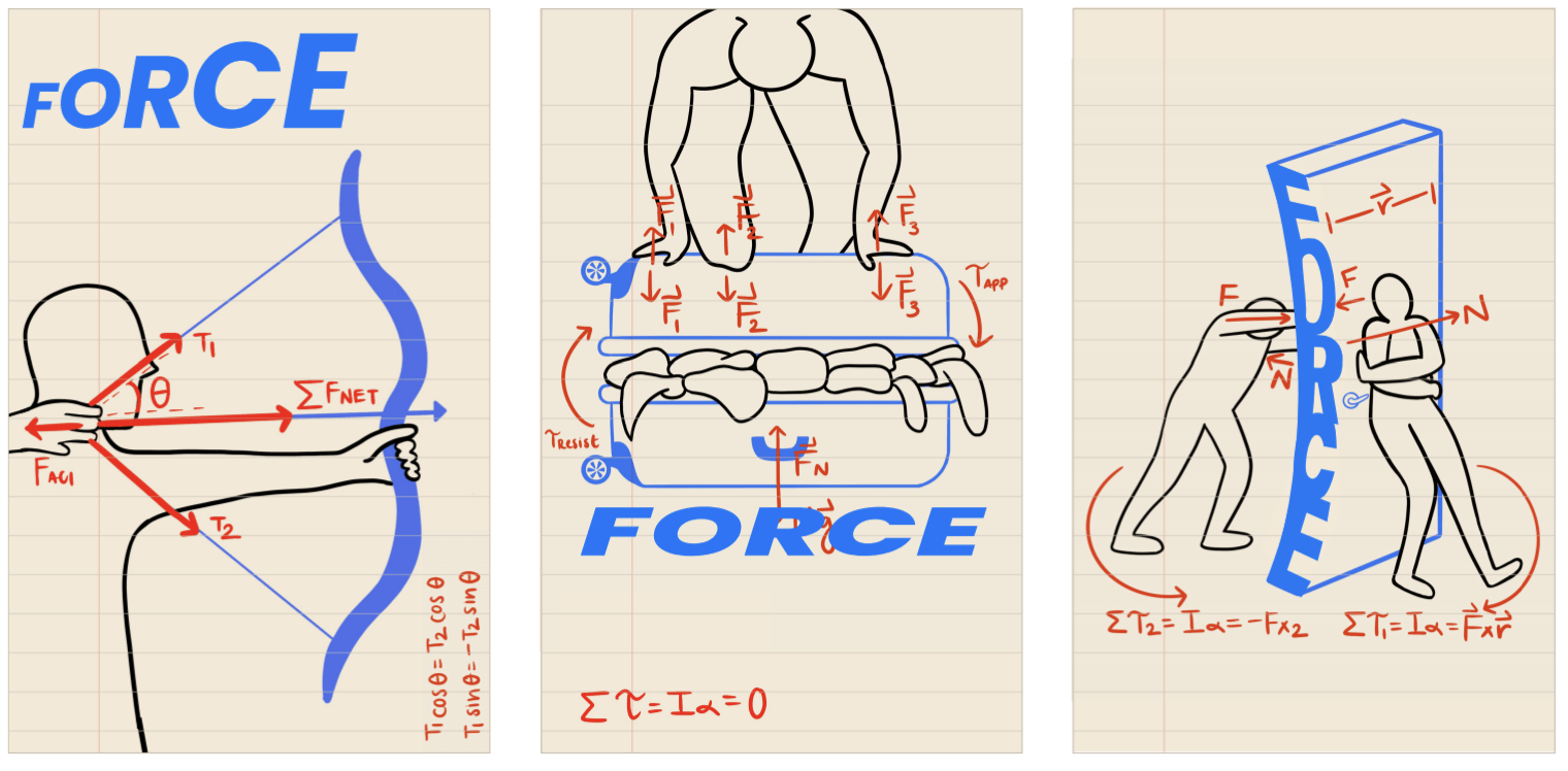
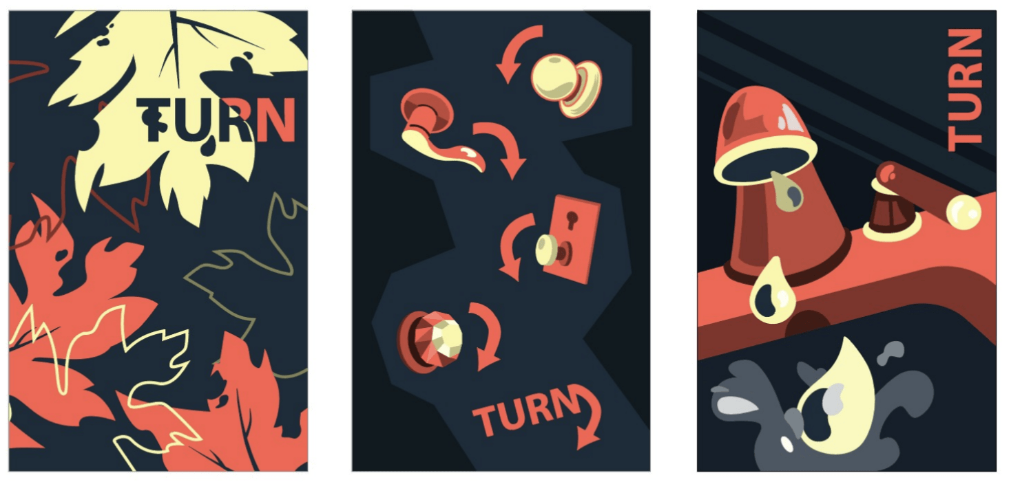
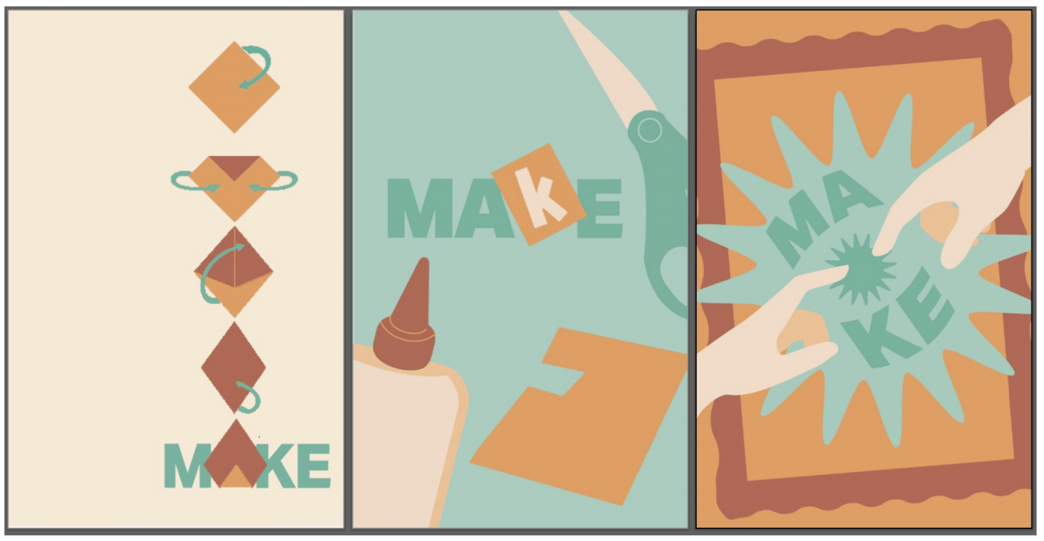
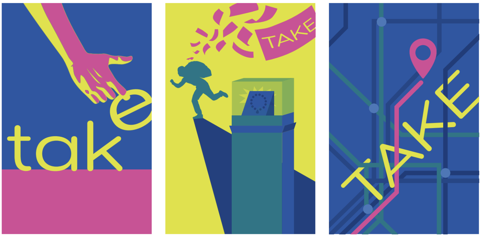
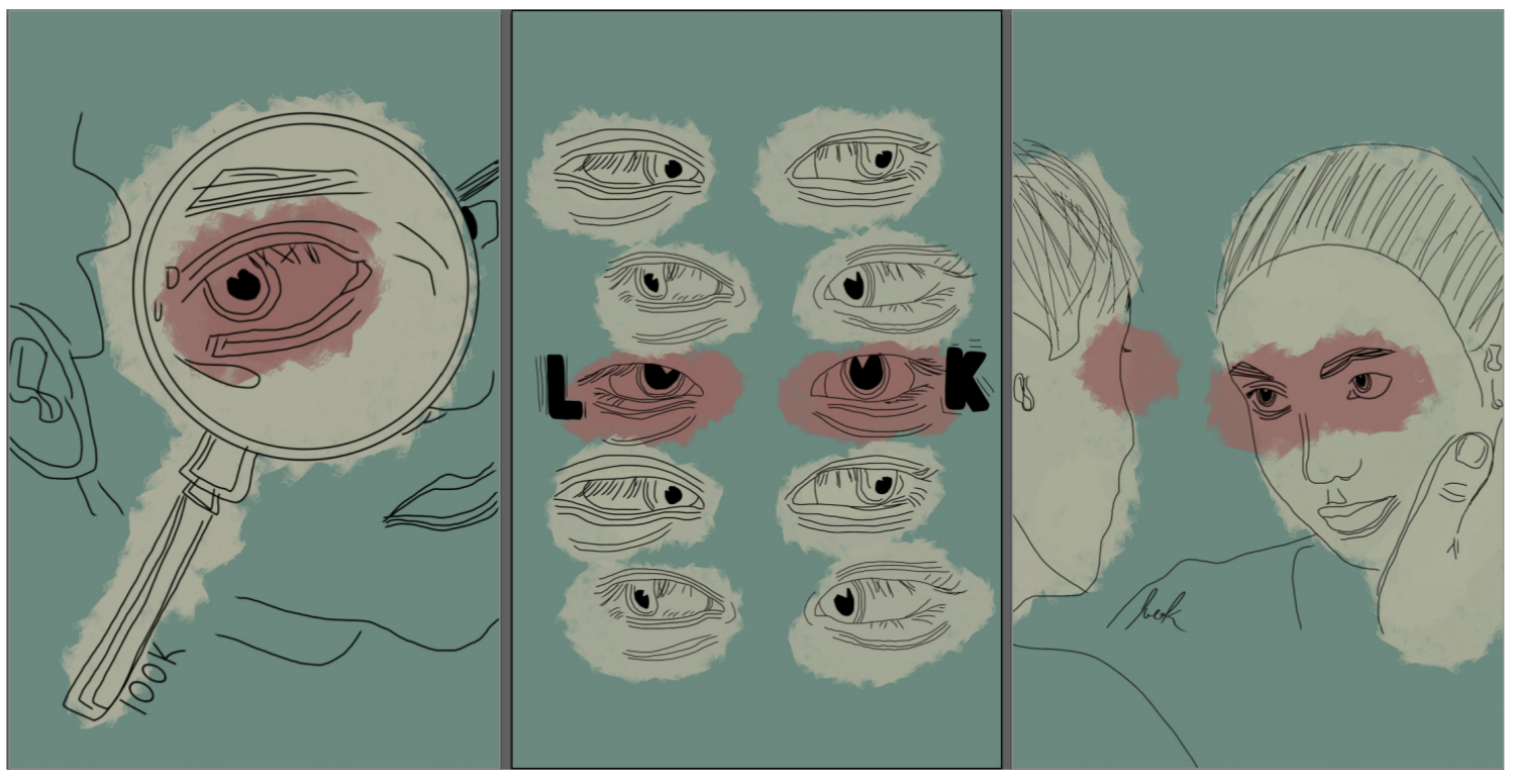
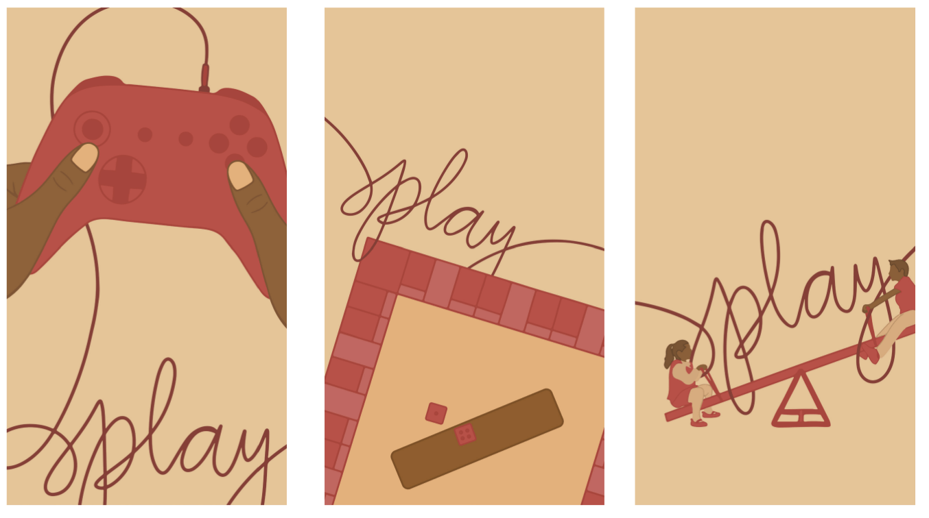
Students explore how different modes of expressive language can shape meaning in visual communication design, specifically looking at a given term in three ways: Practical, Poetic and Persuasive, then designing a panel for each to create a cohesive triptych.
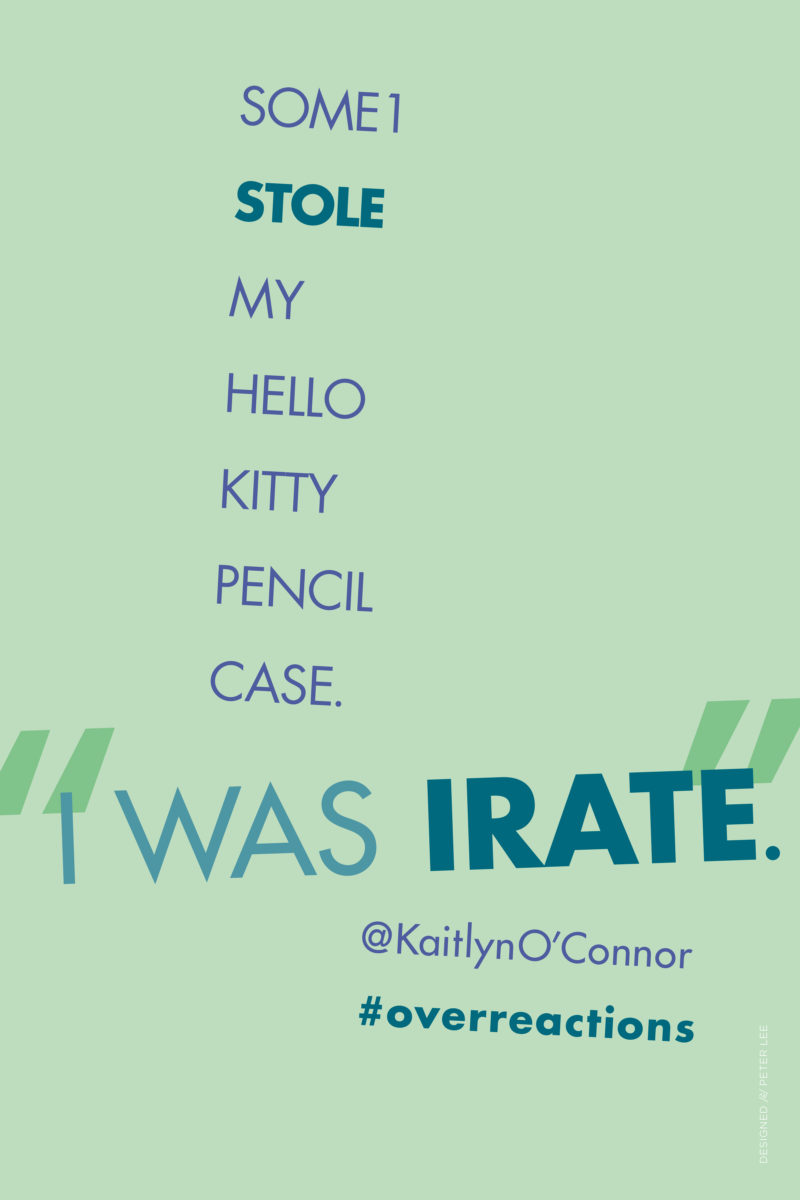
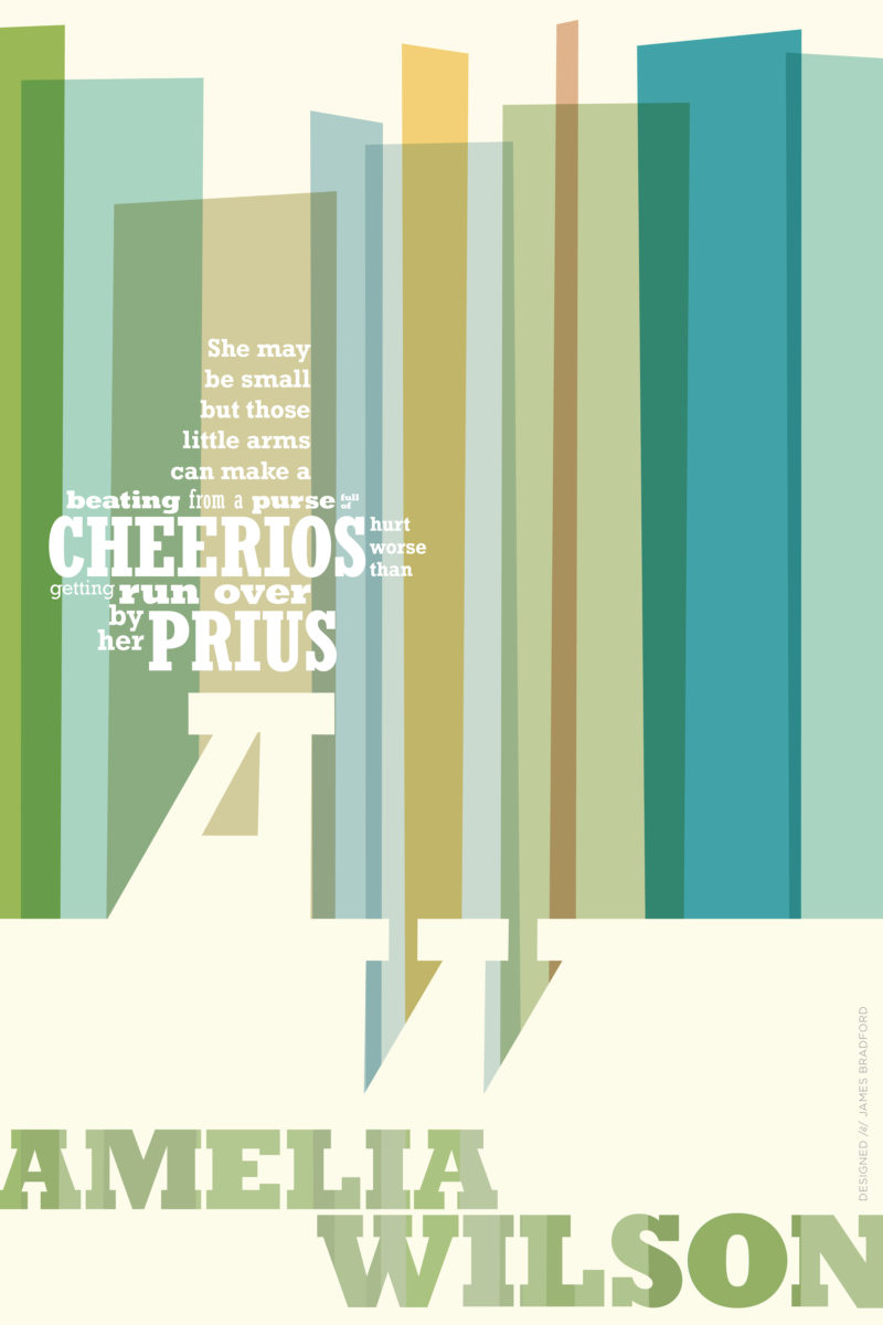
TWEET BIO POSTERS
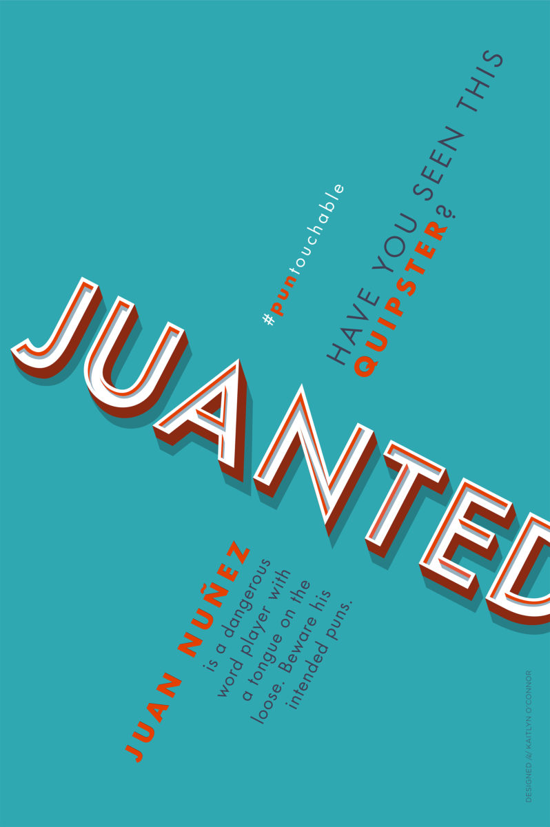
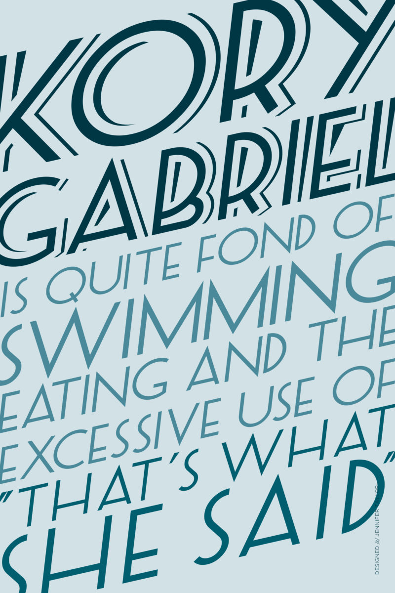
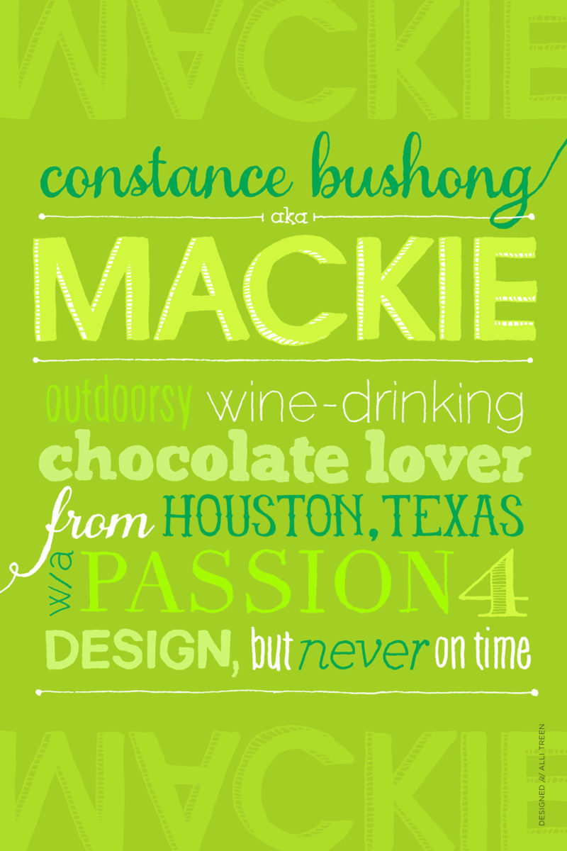
Students interview their assigned partner and write bios of each other in 140 characters or less, then use that copy as content for a typography-only poster.
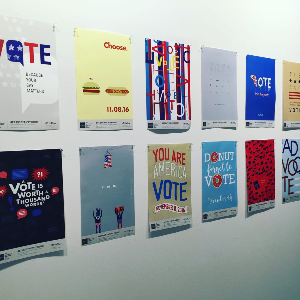
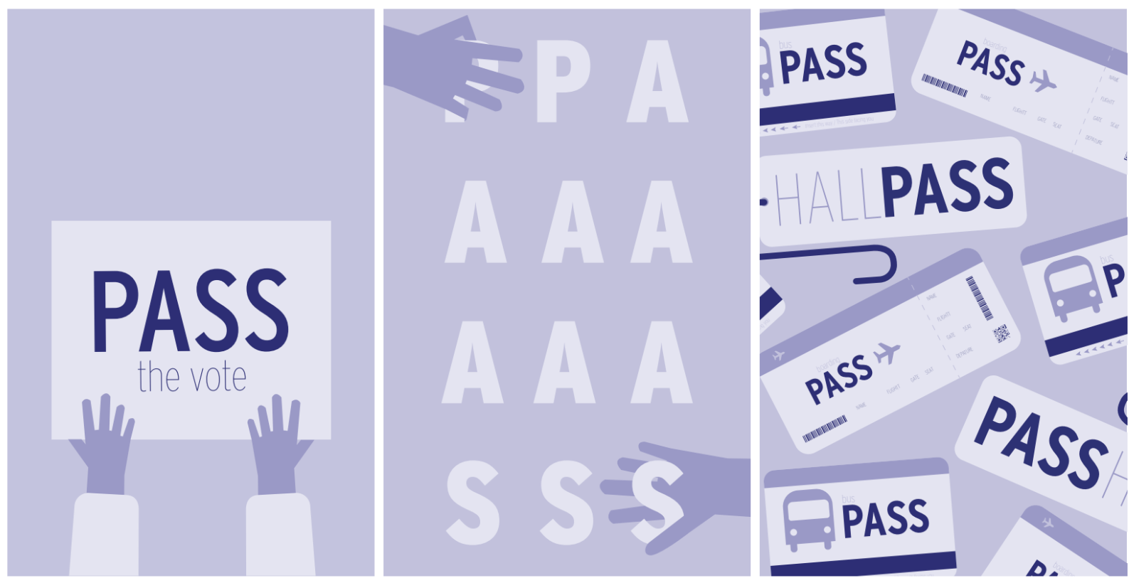
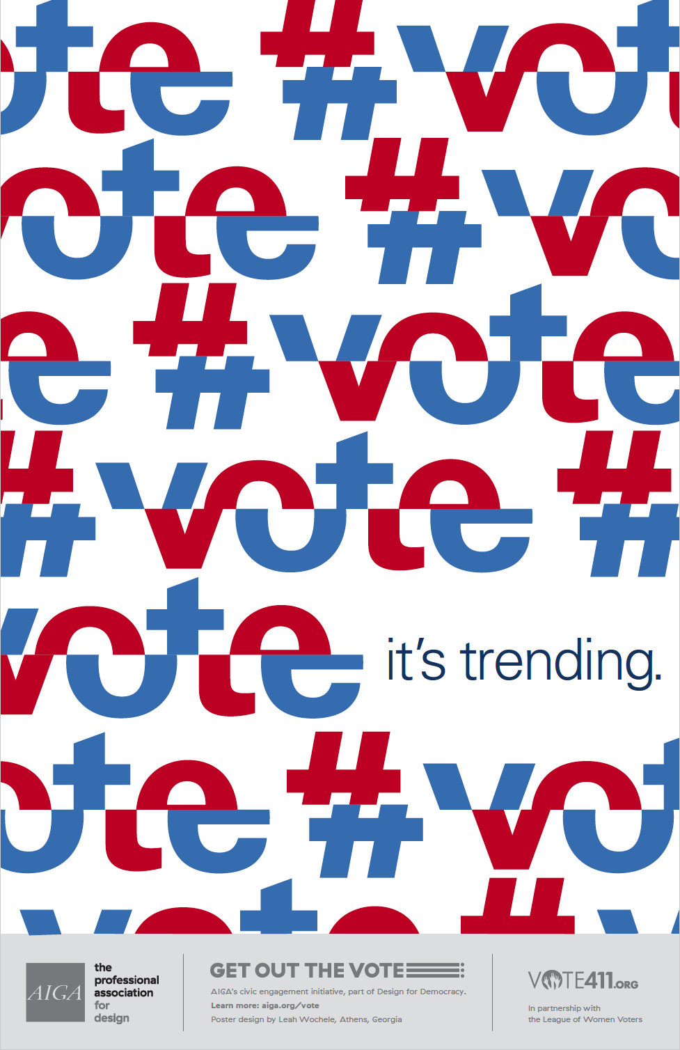
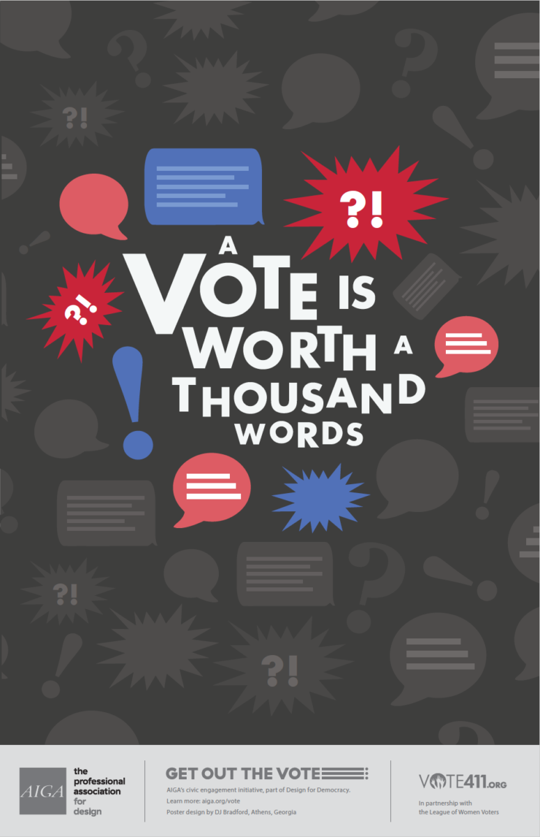
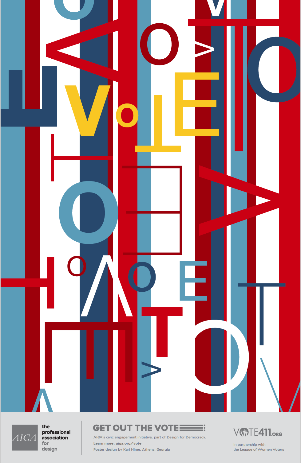
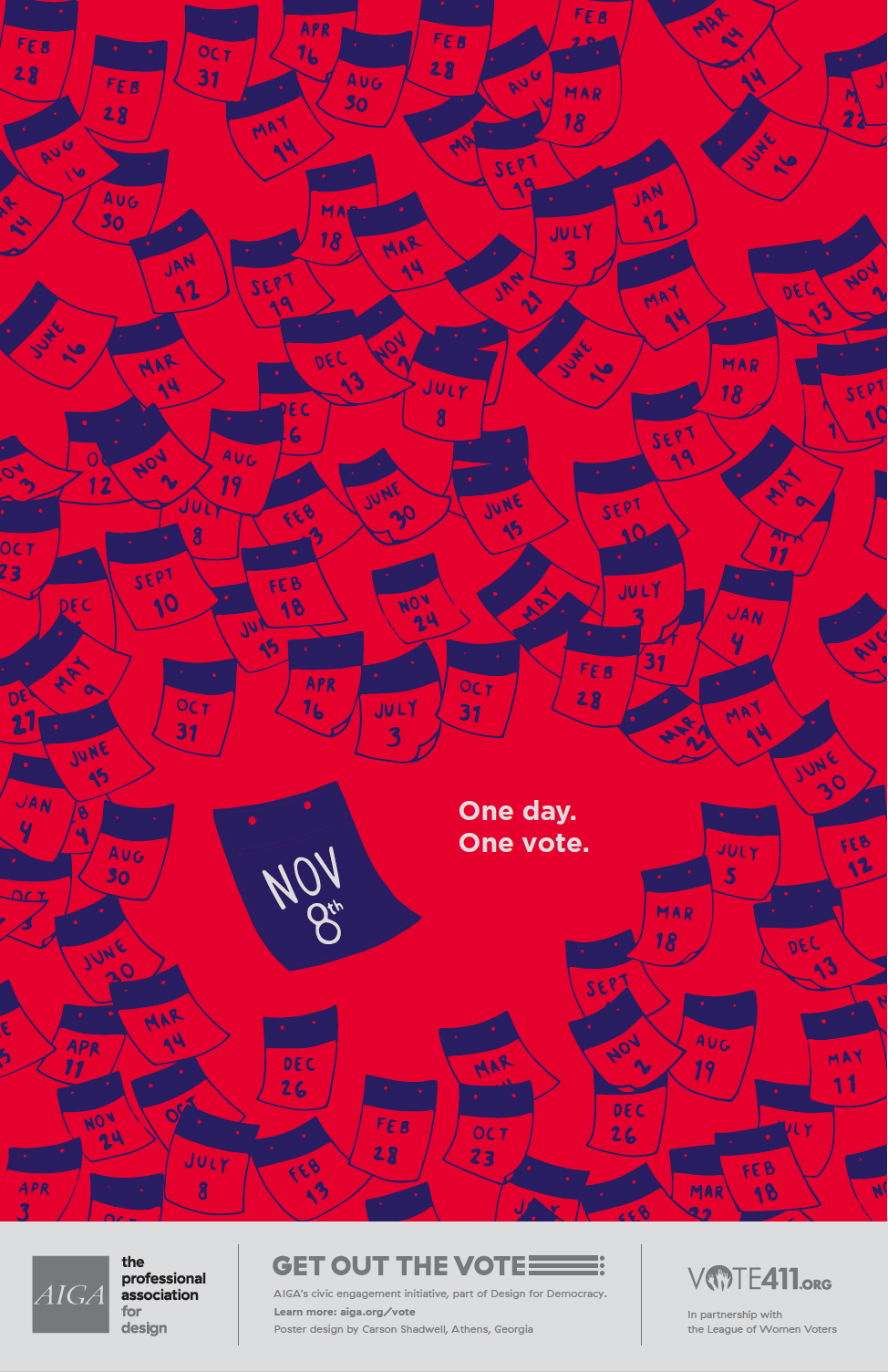
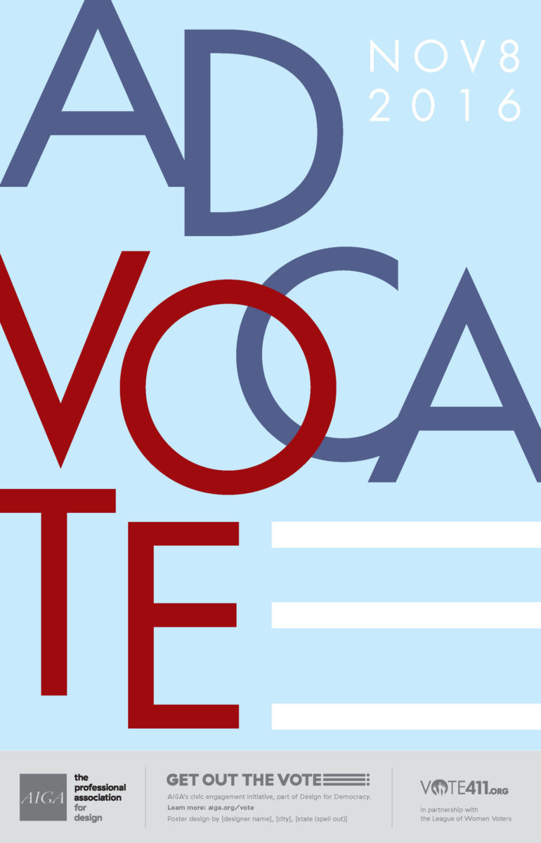
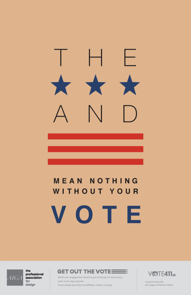
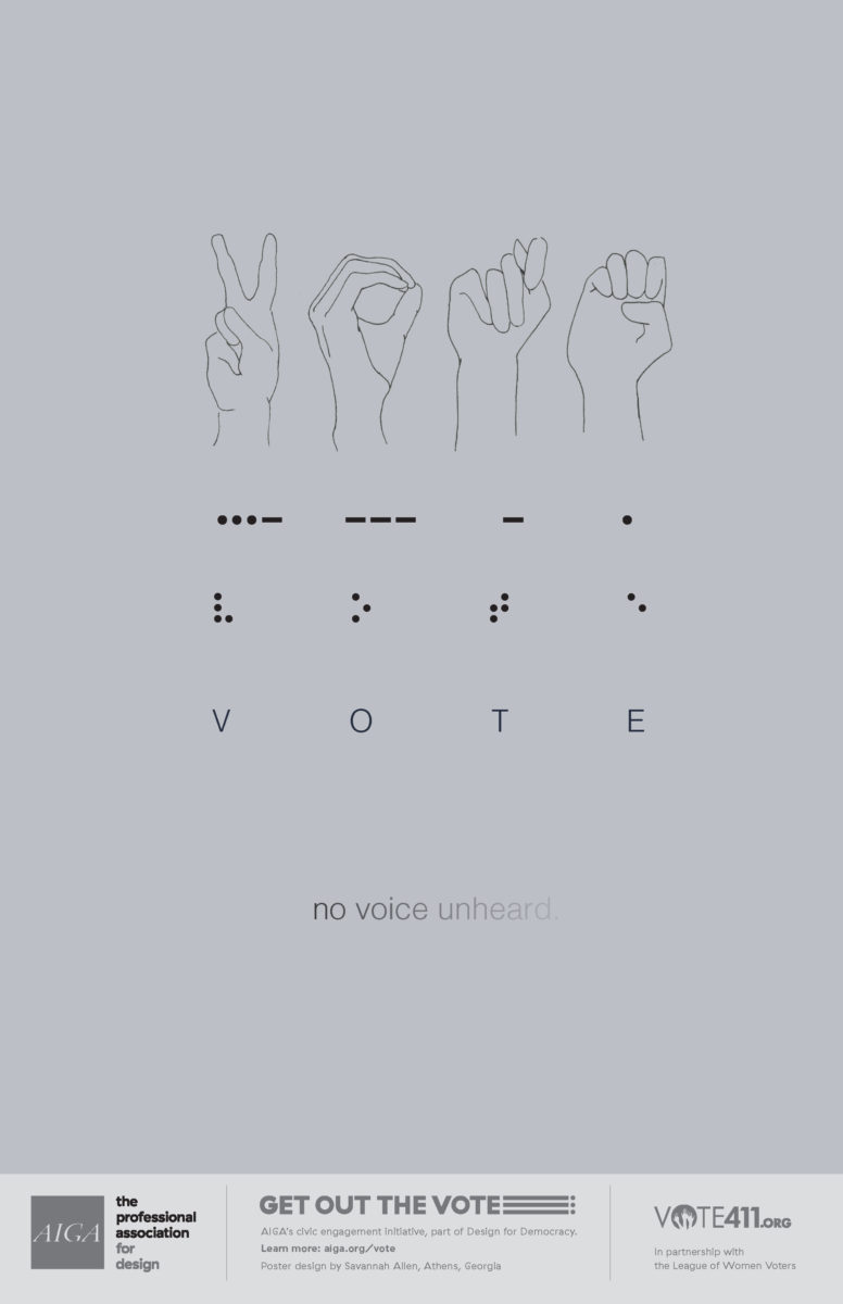
AIGA Get Out the Vote Posters
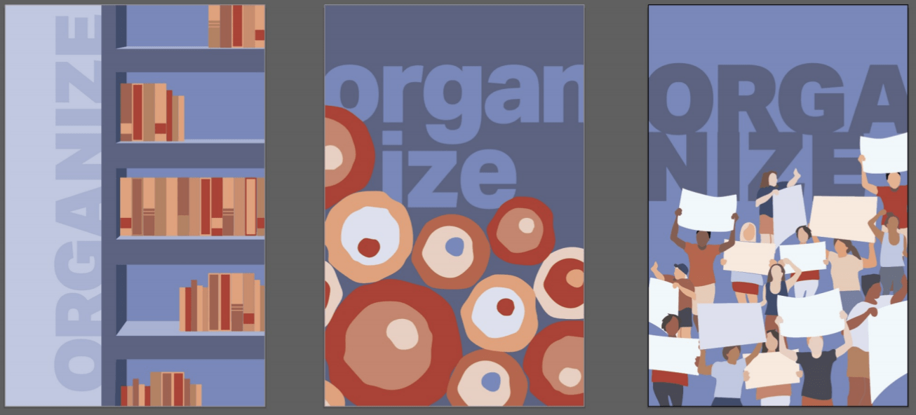
We participated in AIGA’s 2016 poster campaign, which solicits designs from members for posters urging citizens to vote. The posters are then made available to the public for free download and printing. The project falls under AIGA’s Design for Democracy initiative, which strives to use design tools to make interactions between government and citizens more transparent and trustworthy.
Vernacular Redesign
Students critically review a given a vernacular artifact then complete multiple redesigns. Students think about hierarchy of information, composition, typography and/copy-writing, as the cliché imagery and expression of the mundane artifact typically lacks a clear message or concept.
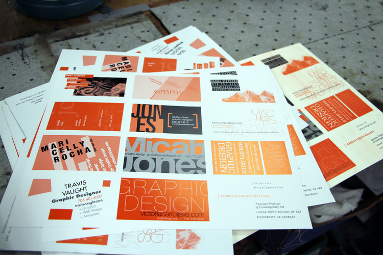
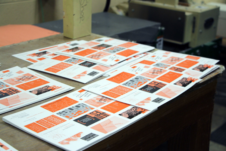
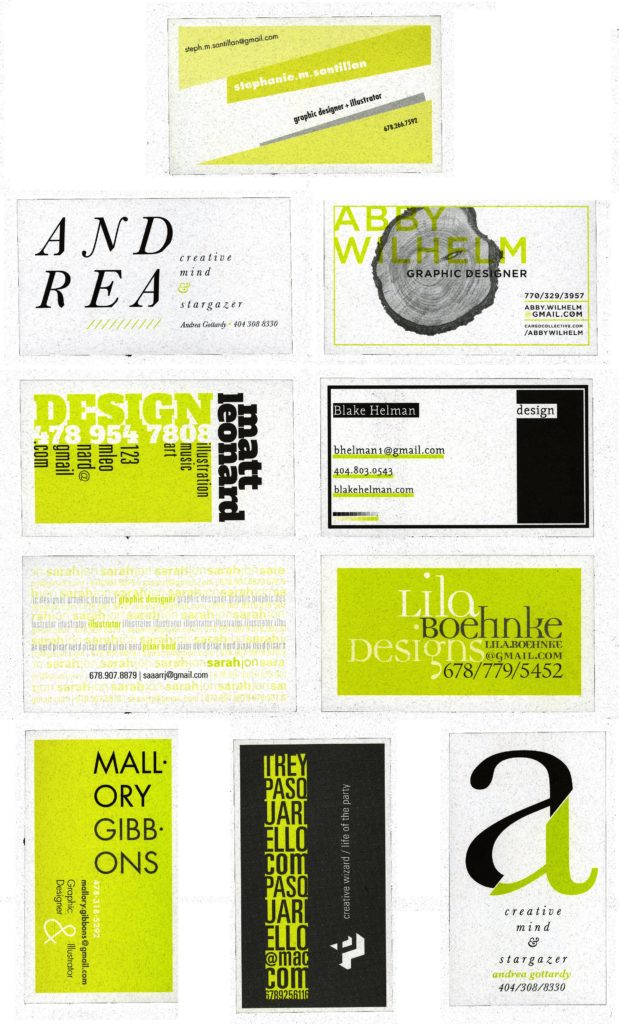
Text as Image & Offset Printing
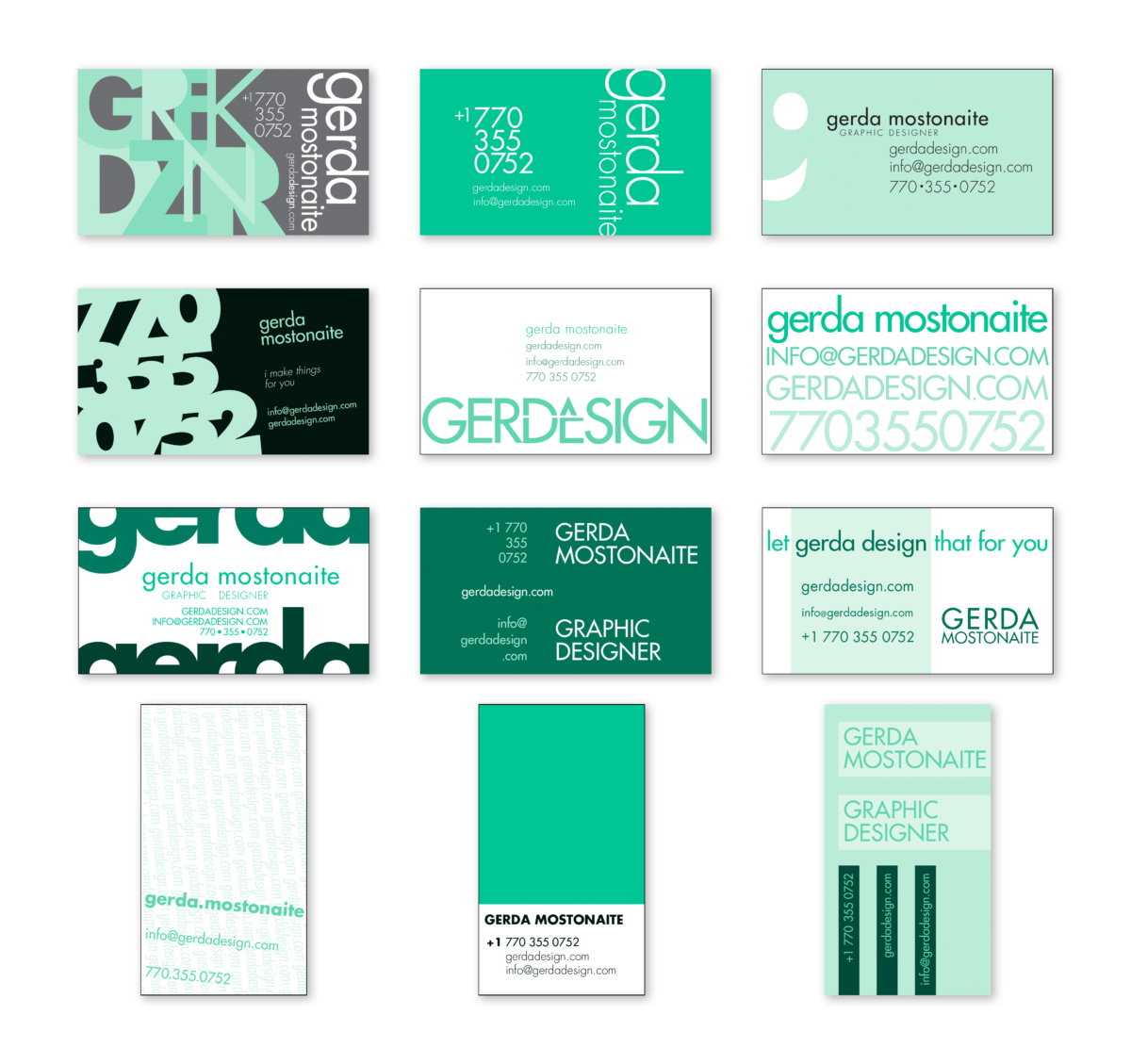
When UGA Printing was located next to the School of Art on campus, we were lucky to be able to work with them to design a print an actual project. In the case of these business cards, students explored the use of typography as both information and ‘imagery’, and also learned about the production process for offset, spot-color printing. We were able to visit Printing Services and see the job on press then each received a pack of their own personal cards. Find more details in this story.
BOOK COVER REDESIGNS
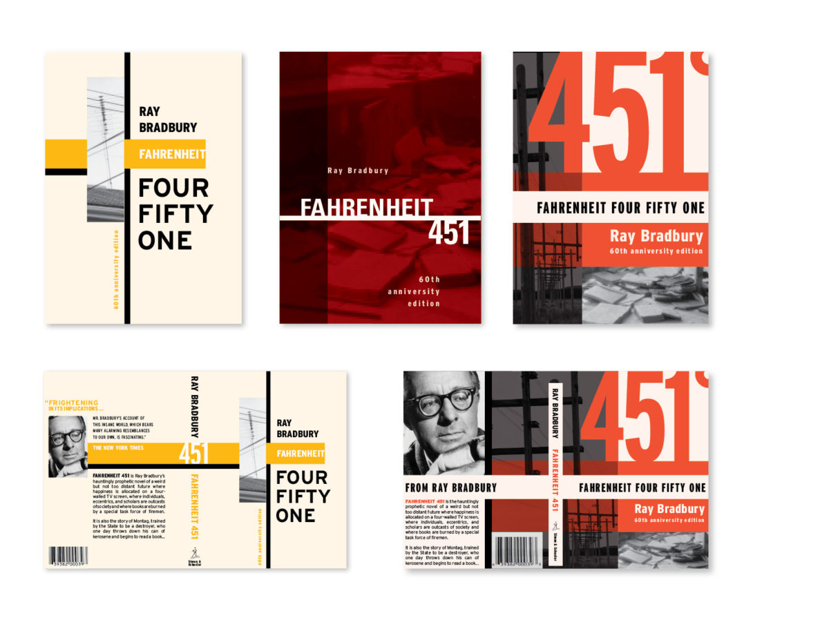
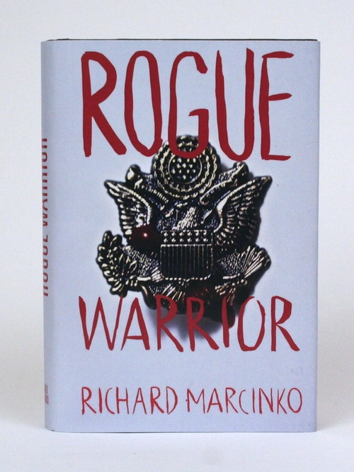
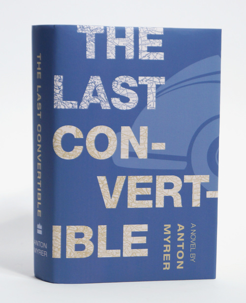
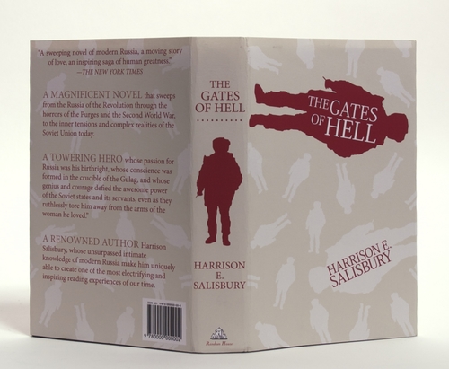
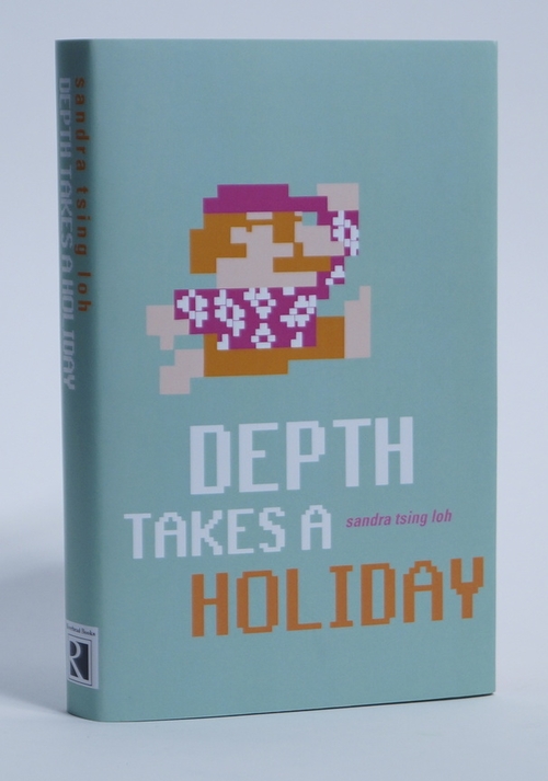
In celebration of the 60th anniversary of Ray Bradbury’s Fahrenheit 451, students created new designs for the cover of this iconic classic. Another term, students were given hardback books from a local thrift store (with missing jackets) and were asked to familiarize themselves with the story then design an appropriate jacket. Students started with research to locate synopsis information and and related reviews.

